HOME | DD
 merriya — Haunted

Published: 2010-11-14 21:46:26 +0000 UTC; Views: 980; Favourites: 20; Downloads: 15
Redirect to original
Description
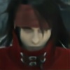
More portraits. I'm tiring of my art -_- it's becoming kinda redundant *artblock ahoy*A belated happy birthday to


Related content
Comments: 26

very outstanding expresion on the face,,great composition and fantastic colouring!i feature this in my group if you dont mind!
you can join too if you want,,cheers
👍: 0 ⏩: 1

Thank you 
👍: 0 ⏩: 1

I like the color scheme, the yellow highlights really make him pop.
👍: 0 ⏩: 1

I was about to say that damn you've been productive 
But I really lvoe the light in this, I mean really. Beautiful shadows and the eyes just pump everything up nicely ^^
👍: 0 ⏩: 1

Thank you, 
And my artblock continues as well, gotta upload something *panics*
👍: 0 ⏩: 0

Ooooo. Yellow and black are such a creepy, unsettling color combo - more so than black with any other color, somehow (at least to me). Actually, come to think of it, the color combo reminds me a bit of...BATMAN ahahahahahahahaha
No, but seriously, this is a cool portrait. The contrast between the extreme saturation of the yellow in the background and the desaturation of the guy's face is incredibly striking.
👍: 0 ⏩: 1


Thank you, I'm glad the colors work
👍: 0 ⏩: 0

Holy mother of! Who do you have to kill to get a wallpaper of this?
👍: 0 ⏩: 1

Thank you, a wallpaper! I'm flattered
👍: 0 ⏩: 1

Oooh but look at the lighting! It's so dramatic!
And you're SO good at drawing facial features. Fight the block!! FIGHT IT!
👍: 0 ⏩: 0

Fantastic lighting!! Just great!!!!!! 
Ohhh... pretty eyes...
👍: 0 ⏩: 1

Its is nice to see that you are back !
I have never had artblock but as far as I know, you should just sit down and draw without really thinking what you ar egoing to draw. *hah this sounds stupid if you say this out loud *
_______
About artwork. Once again there is splendid choice of colours . And because of dark grey yellow looks like gold.
I love his eyes, because they looks emotions and stuff what is going inside his head.
I thnk that there is something slighty wrong with his noise and where are white part of eye?
Anyway his hair and lips makes me droll around
👍: 0 ⏩: 0


*does dorky dance for you*
THANK YOU *smooches pic*
I see branding mark 
You know how well I can sympathize with the art block =_=;
Let's hope we can both overcome it in time
👍: 0 ⏩: 0

WHOO! That is certaily a yellow that means Serious Business.
I love how his eyes are gleaming from the DARK PITS OF HIS SHADOWED EYE SOCKETS @,@ Look into my entrancing electric yellow eyes, little girl. Pretty little dot of blue @,@ I'm such a dork
👍: 0 ⏩: 0

Awesome! I really like the colours and lighting, and the expression. I think it all works very well together.
👍: 0 ⏩: 0

but all your portraits look different XD. the yellow makes this really dynamic and the eye color is nice/pops out.
Is that a scar on his right cheek?
👍: 0 ⏩: 0

You're very welcome
👍: 0 ⏩: 0


