HOME | DD
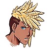 RalDu — [Rise Against] Azule 2.0

#against #anime #big #characterdesign #cool #digital #dupree #manga #ralph #redeyes #rise #sword #raldu #art #onyxbolstersword #original #originalcharacter
Published: 2016-05-27 14:41:49 +0000 UTC; Views: 2255; Favourites: 25; Downloads: 0
Redirect to original
Description
Not much of a change, because I'm satisfied with his current appearance...Anyways, because I haven't uploaded a lot, decided to add some character renders? Designs? Character art. in the past, I wasn't quite able to create the characters the way I wanted. The tint was either too dark, or too saturated, so here are some "2.0" versions of my Characters!
Here is Azule!
Btw, some characters don't have previous designs so they wont be "2.0" at all.
Azule © Me
Related content
Comments: 13

Excellent work. I' haven't seen too many quality Black male characters like this.
👍: 0 ⏩: 1

Thanks pal! I know exactly what you mean, I wanted to make a character that wasn't stereotypical, y'know? Hopefully the series makes it off its feet
👍: 0 ⏩: 1

Is there List or notification I can sign up for?
👍: 0 ⏩: 1

Not at the moment, I'm actually going to make a tumblr page so people can keep up with updates fir the game and character designs
I will also have a kickstarter for it up soon as well, I'll let you know when they are up
👍: 0 ⏩: 1

I'm glad you didn't change him much. He was great the way he was and this signifies his stern and powerful design. Those shoes have good detail to them, as well as his pants. The shiny weapon also has a great design and a newer feel to this new drawing. Great work here too!
👍: 0 ⏩: 1

Azule wont really change as im all too satisfied with how he looks, his skin color however (believe it or not) is slightly different, I use to have him as a yellowish brown tint, and switched him to a more reddish tone, this worked wonders with his red bands around his wrists,
👍: 0 ⏩: 0

Nice and official looking. Good shit. Though, I have to say he looks a little slimmer than before. Oh yeah, I've been meaning to ask about his hair but I keep forgetting. The back confuses me a little, the tail-like thing. Was just wondering what's going on with it, is there some kind of special significance or just a unique design decision?
👍: 0 ⏩: 1

Both significant ABD a unique design.
The significance will be revealed in the story.
But the design is to separate him from various other black characters with "unkempt hair"
👍: 0 ⏩: 0

Thanks! He is the main character of rise against!
👍: 0 ⏩: 0


