HOME | DD
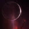
 MaxDocker — Tranquillity

Published: 2013-12-13 20:55:19 +0000 UTC; Views: 3278; Favourites: 175; Downloads: 0
Redirect to original
Description
Notice: You may not use for stock, re-upload, replicate, manipulate without my permission. You may not use for commercial purposes without my permission. Please respect this. Thank you. ©Max-WD 2011-2015. For personal nonprofit use only. Property of Max-WD. All rights reserved.
Photoshop CS5
Planet texture created using Visible Earth
Faves and comments are all appreciated.
Related content
Comments: 20


When I look at this piece, I imagine levitating around in space as if it was a lightyear-deep ocean. The stars look like giant bubbles in the far distance.
The planet reminds me an iceberg, slowly floating around in the ocean with no particular direction.
This aimlessness is what gives this piece its peaceful nature in my opinion. The colors calm my spirit.
I've seen some pieces with this setting, but in space art you really need to be extremely creative to invent some original settings for the planets. There is simply not so much option. There is no perspective in space art. You only create a background and add a planet or two somewhere, add moons and that's it for the setting. Maybe rings or asteroids can help out, but there is not so much connection between the major objects of the piece, making an original setting very difficult.
However, the real playground starts with is the texture of the planet and most notably, the background.
The background has been kept in one hue, which is not forcibly bad. But I will recapitulate a coloring issue later.
The way the shading of the nebula flows towards the lightbeam is very nice in my opinion.
The technique of this is far over average, professionally made.
As usual, the texture is wonderful. You always get this unique "mountain sierra" pattern in it which is also high quality and high-detail, which is what I like about it. To be honest, the texture style is very remarkable for you. You could as well call it a typical "Equinox-Texture" e.deviantart.net/emoticons/b/b… " width="15" height="15" alt="


I would love to learn from you how to make these.
Also, the nebula does not seem to have repeating patterns, it's very straightforward and beautiful. I can identify a few brushes, but I use them too and I believe every space art has used them e.deviantart.net/emoticons/b/b… " width="15" height="15" alt="


The coloring of this image is kept in one hue. This could be intentional so I can't count it as a bad thing, but I see that you've made a mistake while adjusting contrast, which is not really your fault, it's photoshop's. But it does mess up the colors, which is why I'm going to tell you how to solve it. It happens to me very often too, you must know.
But it's solvable really easily.
When you adjust the shading, photoshop does a poor job of translating the proper colors. Photoshop will make the lighter shades lighter and the darker shades darker. In order to sustain the proper mathematical luminance, photoshop will seperate all light-blue colors into pure cyan, which is lighter, and pure blue, which is darker.
Also, because the image receives more contrast, the hues also receive more contrast, which will increase their saturation.
This fucks up the colors.
This is what happened here when you tried to regulate and play around with the contrast.
If you look closely, you will see that there is a sharp transition between pure blue and pure cyan at the highlights of the image.
You can easily work against this problem if you desaturate the image before contrasting it. This will shift the separation point of the colors towards a more extreme level, giving you more playing space (:
Photoshop does that with mixed colors usually.
When you have orange hues, they will be separated into yellow(light) and red(dark).
When you have a limette hue, it will be separated into yellow and green
When you have a purplish hue, it will be separated into magenta and blue.
Go try it out if you wish.
Otherwise, the image is very nice. I always like it when you upload a new picture, because Equinox is a master of beautiful colors. Even though this color thing happened here, I know that this is not an issue for you as I've seen other of your pieces, where the colorization really ripped my jaw apart sometimes. The colors of your pieces are piercing. That's a proper word to describe it.
Keep up the good work. (:
👍: 0 ⏩: 2

Nothing to thank for (: The problem occurs with contrast adjustment in general, it doesn't have to be the contrast function or the levels.
👍: 0 ⏩: 0

Thank you so much a great critique, BonusExperiment. In terms of adjusting contrast, I didn't use the adjust contrast function. However, I applied the image, applied a photo filter (Dark blue), duplicated it twice and used several different blending modes, which as you know, can alter the contrast of an image. Thanks for the tip about desaturation, I will give it a try next time. I usually find that the final process of duplicating applied layers, and using different blending modes adds something great to the image, but this usually comes at a cost of degrading some other aspect of the image. The nebula is a mix of an old fractal I made years ago and brushing with the soft round brush. I rarely use fractals for nebulae these days as I'm trying to work on my nebulae painting skills, but this one looked quite good after some editing.
Great critique, my friend, well balanced and I learned something from it. Thanks again.
👍: 0 ⏩: 0

All of your artwork is beautiful beyond compare, but the black borders are a massive turn-off. I can't stomach them.
👍: 0 ⏩: 1

Thanks for the feedback!
👍: 0 ⏩: 0


