HOME | DD
 ElenaR — Mischa Barton

Published: 2005-01-28 20:54:05 +0000 UTC; Views: 12999; Favourites: 248; Downloads: 594
Redirect to original
Description


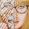
 now here's my example, how a drawing should NOT look. Well best to show, there's soooo much to learn, I'm really not happy with this one, that's why it's unfinished and will definately stay unfinished


Well what did I learn?
-don't use stompers to smudge on the face
-don't try to erase the whole shading, to do it better on the second try...
-second tries don't look any better...
hope I learned more than that...
Well look at some real imperfection


 , next will be better, otherwise I won't submit it


btw Mischa is cute, isn't she


 ?
?More Mischa drawings:
no2:
Related content
Comments: 100

Whatever you did here really worked, and you should definitly make the same mistakes again - because this drawing has got incredible life in it!
👍: 0 ⏩: 0

What do you mean, don't use stomps to draw on the face....?
u know, yesterday i did the same thing.... Rubbed out all my shading and now it looks crap. Got to start over again!
P.S. This mischa LOOKS FREGGING AWESOME UNFINISHED! it's not bad at all. I can tell it looks like mischa more that the darker one you drew of her
👍: 0 ⏩: 0

ummm actually I think this is my fav altho you think it isn't a good example .. and altho it isnt complete but I think its jus right 

👍: 0 ⏩: 0

Nice. I like the way the face is emphasized more.
👍: 0 ⏩: 0

If by unfinished you mean the white around the outside I think you should leave it. It looks so much more interesting that way.
👍: 0 ⏩: 0

amazing espression!you've capture the soul in her eyes!
👍: 0 ⏩: 0

You know what's strange? I think it looks fine. Oh, yes, there are some mistakes and whatever (not too noticeable, really), but I like the simplicity of the drawing. The way the hair falls around the face gives it a very nice frame.
👍: 0 ⏩: 1

hehe I started liking it after sometime and many positive reactions 
Thank you
👍: 0 ⏩: 0

While this one may not be as technically good as your more recent pieces, I really like the composition of it in its unfinished state, and I don't feel that its technical imperfections detract at all.
👍: 0 ⏩: 1

Thank you so much, this piece still amazes me, I was so unhappy with it when I drew it but now I really like it and try to achieve this special something it has again ...by now without success
Thank you Sidney, also for the favs
👍: 0 ⏩: 1

I don't think this piece would have the same draw (no pun intended) if you had finished it. The look on her face is aluring, and almost secretive. The few wisps of hair, and otherwise unfinished framing emphasize that. I faved your latest WIP because it gives me a similar feeling, in its current state.
I have been finding that I prefer extremely realistic drawings which have something in the composition that clearly defines them as a drawing. I have a passionate love for realism, and at its best, I think realism is capable of conveying far more than a photo ever could. "Unfinished" sections, graphite/colored transitions, and style changes (sketch and realism in the same piece) are just three of the tools that can be used to emphasize different aspects of a drawing.
That is part of what irritates me slightly about Best of Friends, which is far and away my most popular piece. It is arguably my best piece from a technical standpoint, but it is simply a copy of a photo. There is absolutely nothing that I did with that drawing to make it stand apart from the photo I referenced. Don't get me wrong. I love it, and I appreciate every comment and fave it receives, but there are other pieces that I wish would receive the same level of attention, or at least something comparable.
Total side note.
In looking through your scraps, I get the impression we approach drawing in a similar way. I always start with the eyes, and finish each part of the drawing completely before moving on to the next. If I mess up a part beyond repair, I usually stop there and never finish it.
I also wanted to tell you that all of the drawings in your gallery are without a doubt amazingly well done.
👍: 0 ⏩: 1

ah damn your comment vanished after submitting my latest portrait
I agree with you on this piece, I kinda like it nowadays, made my peace with it
I know what you mean, I like it as well when even in the most realistic drawing it shows it is a drawing 

Yeah I always start with the eyes can't help it, then finish the face. I do it cause I love drawing eyes and faces most, so if I draw the stuff I don't even like first and then mess up on the face ...that'd be really annoying
Thanks
👍: 0 ⏩: 0

I've read comments on this deviation and I must say I agree. I think this is gorgeous and I can't find anything about this drawing that I think is wrong. I've seen the original photo of Mischa Barton and it looks just like it! Good work, hope to see it finished sometime? D
Btw, rest of your gallery is awesome, I SO envy you!
👍: 0 ⏩: 1

I don't think I will finish this, I started to like it like this and wouldn't dare to touch it after such a long time
No need to envy me your stuff is really good and you're improving pretty fast
Thank you
👍: 0 ⏩: 0

I simply do NOT see what you see... and I am pretty good and finding things. You are WAY to hard on yourself. This piece is excellent... that lines are very sharp and becoming and the piece pops!
👍: 0 ⏩: 1

Well it still amazes me how many people like this
...made me like it a little better as well
Thank you
👍: 0 ⏩: 0

You may not be happy with it, but it does have an interesting quality to it just by it being unfinished. I don't think it is as bad as you may think. Well at least I like it
👍: 0 ⏩: 1

hehe thank you, it's shocking to see this is among my 10 most popular drawings
...that makes me feel a little better bout it though
👍: 0 ⏩: 1

Just goes to show you never truly know what the masses are going to like.
👍: 0 ⏩: 1

yeah I wish I knew sometimes
👍: 0 ⏩: 1

You think that's bad?? If it makes you feel any better, it's about ten times better than anything I've ever drawn.
👍: 0 ⏩: 0

I think you posted the wrong photo. This looks great to me. If you want to see what kind of smugging stompers (tortillions) can do when in the wrong hands (mine) take a look at my latest, Sarah 1 at [link]
👍: 0 ⏩: 1

Doesn't look that bad to me 
Well afterall and after a pretty nice response I made peace with this drawing, could have done better but I don't worry about it anymore.
Thanks
👍: 0 ⏩: 0

Januaryid, angelina2 are simply great but this one takes the cake. And may be you are not happy with this one, after all, dissatisfaction is the first step to doing better work, i like it still.
Explore, experience, enjoy.
👍: 0 ⏩: 1

Thanks a lot for the kind words. You're definately right dissatisfaction is a must to be able to improve.
👍: 0 ⏩: 0

there may be mistakes, but it is still one of the best drawings I've ever seen.
👍: 0 ⏩: 0

You don't like this one ????? You didn't finish it and that's the reason wich create a wonderfull illusion of 3D ! The faces is like behind the sheat of paper. The nose and the right side of the face are really gorgeous.
👍: 0 ⏩: 0

yeah ok i dont need to tell it looks great.,look at all those comments so ill spare you the ''NO ITS GREAT DRAMA''.,you probably got it.lol.,it looks real got though not exactly like Mischa and the mouth looks different.,but otherwise it great.,good.,job
👍: 0 ⏩: 0

Regardless of what you say, I think this is wonderful. I really really like the hair depicted in that way, it works brilliantly.. and it's a lovely idea that I've not seen done before (I'm inspired to go and find myself some blonde models so I can experiment with this...)
👍: 0 ⏩: 1

In a weird way I have accepted how this looks and finally even like it too. Thanks
👍: 0 ⏩: 0

I actually think this looks great. I know you said the hair is not finished but it works very well as it is. The eyes are really great too. It is to my liking!!!!
👍: 0 ⏩: 0
| Next =>


