HOME | DD
 Breogan — Scroll - Namarie

Published: 2006-01-12 16:25:30 +0000 UTC; Views: 10917; Favourites: 231; Downloads: 207
Redirect to original
Description
or "Namárië Revisited"Namárië. Altariello Nainië Lóriendessë
("Farewell. Galadriel's Lament in Lorien").
Ai! laurië lantar lassi súrinen,
*Ah! like gold fall the leaves in the wind,
yéni únótimë ve rámar aldaron!
*long years numberless as the wings of trees!
Yéni ve lintë yuldar avánier
*The long years have passed like swift draughts
mi oromardi lissë-miruvóreva
*of the sweet mead in lofty halls
Andúnë pella, Vardo tellumar
*beyond the West, beneath the blue vaults of Varda
nu luini yassen tintilar i eleni
*wherein the stars tremble
ómaryo airetári-lírinen.
*in the voice of her song, holy and queenly.
Sí man i yulma nin enquantuva?
*Who now shall refill the cup for me?
An sí Tintallë Varda Oiolossëo
*For now the Kindler, Varda, the Queen of the stars,
ve fanyar máryat Elentári ortanë
*from Mount Everwhite has uplifted her hands like clouds
ar ilyë tier undulávë lumbulë
*and all paths are drowned deep in shadow;
ar sindanóriello caita mornië
*and out of a grey country darkness lies
i falmalinnar imbë met,
*on the foaming waves between us,
ar hísië untú


 a Calaciryo míri oialë.
*and mist covers the jewels of Calacirya for ever.
Sí vanwa ná, Rómello vanwa, Valimar!
*Now lost, lost to those of the East is Valimar!
Namárië! Nai hiruvalyë Valimar!
*Farewell! Maybe thou shalt find Valimar!
Nai elyë hiruva! Namárië!
*Maybe even thou shalt find it! Farewell!
(J.R.R. Tolkien)
I finally decided to have another go at this project of the Namárië Scroll. I am definitely happier with this one than I ever was with the previous version. Still, it could and should look better... need to practice my calligraphy more often


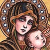
The painting of the Lady Galadriel is based on one by Alan Lee.
Parchment, pencil, calligraphy pen, inks (black, golden and silver), cream watercolours and PS CS (the scanning killed all the textures and highlights, making them look flat and brownish/blueish. I have used PS CS in order to "fix them")
Related content
Comments: 133

*speechless*
you've done great with the writing, whenever I try to use the tengwar it looks terrible...

👍: 0 ⏩: 1

My goodness, you do gorgeous work! I now have something to strive for in my calligraphy studies.
👍: 0 ⏩: 1

Oh........you are so good at these kinds of things.....I love that poem.....It's very lovely, even in English and especially in Quenya!
👍: 0 ⏩: 1

Glad to know you like it
Thanks for your comment
👍: 0 ⏩: 0

beautiful works
I adore this poetry, from when I read it for the first time .
I have learned listening the tolkien voice (a old registration)
👍: 0 ⏩: 1

geez this is sooo beautiful 
really beautiful thing
👍: 0 ⏩: 1

It's not at hard as it seems. I learned the tengwar charts years ago when I read LOTR. That's when I developed an unquenchable interest in languages, including elven tongues 
I used parchment (synthetic vellum), temperas, inks and calligraphic pens
And thanks a million once again
👍: 0 ⏩: 1

well maybe if I tried harder... 
and Your welcome so much
👍: 0 ⏩: 0

This is really beautiful. I like that it resembles medieval illuminated texts. Amazing work.
👍: 0 ⏩: 1

Wonderful, love it, WAY better than mine...
but how do you get that "ng" into the "yéni" part(s)?
👍: 0 ⏩: 1

And you lack an A above the V in Enquantuva (sorry to be so critical, but I have a flaw; I only see mistakes... sorry...)
Who am I to talk, Mine's full of mistakes and obvious tehtar-misplacements...
👍: 0 ⏩: 0

Having commented on your other callig/scroll pieces, I want to comment on this one as well.
You have the same mantra I do BTW.
I like the spacing you gave the text and I especially like the gold surrounds and fill-ins for the letters and vowel symbols (I forget the term for them, sorry). I also like the peacock at hte terminal of the border due to it's simplicity and elegance. My only quibble is the 'intensity' of the inklines of Galadriel's face, I would have had them a bit lighter, or made the outer lines of her gown and hair of an equal intensity. I do like the halo effect of the flower behind her head, the proportion to the figure is perfect.
I have found that cutting the sides of my nib holder so it is triangular in cross section lets me have better control over the angle of the nib. Do you have any tricks of that sort that you use?
👍: 0 ⏩: 1

Thanks
The elvish characters are known as "tengwar", and the vowels ones, in this case, are called "tehtar".
Yes, I am aware of the problem with Galadriel's face, but this is a WIP anyway, actually this is my second version of this scroll, and I know I will have to get back to it and change and add a few things since Im not 100% happy with it. I'm just too busy right now with other projects to dedicate any time to this
I'm afraid I have no tricks I can pass on 
👍: 0 ⏩: 0

Ah right! This one is tengwar! Also very neat. I thought that one could make a tehta long wiht it still over a tengwa. I thought you could just show this by putting a dot underneath the tengwa. I'm not sure though as I haven't written or read tengwar in a few months and I just figured that by looking at samples without actually reading that anywhere.
Love the peacock!
👍: 0 ⏩: 1

Thanks
As far as I know, the dot underneath a tengwa indicates the consonant is not followed by a vowel. Also, IIRC, there are only two ways to indicate a long vowel in Quenya, one is by using the long carrier, as I have done, and the other one is by doubling the tehta - and, according to Tolkien, this should not be used with all the tehta, only with accents and curls, so this would not an option when representing á
👍: 0 ⏩: 2

May I ask where you learned to write tengwar?
👍: 0 ⏩: 1

I first learnt the basics with the help of the LotR App. Then I looked for linguistic sites dedicated to Tolkien's works, and I learnt it from there, together with the tongues themselves. Having said so, you can find tengwar transcriptions of Namárië just browsing the net, Tolkien made different transcriptions of his poem that people have uploaded onto their sites.
If you want more information on any Tolkien linguistic topic, visit: [link]
👍: 0 ⏩: 0

Oh my it's very pretty!!! (Like the rest of your tolkien art ^^). I love the geometric designs, and the stylised drawings of Galadriel and the peacock. And personally, at times she *does* remind me of one. I don't know why... maybe it's her "proud Noldor" personality, or the whole "man-maiden" thing. ^^
👍: 0 ⏩: 1

Apologies for the belated reply - haven't seen this comment until today
Thanks a million for your words
I agree with the "proud Noldo" part, although I have always related peacocks to beauty and vanity
Again, apologies
👍: 0 ⏩: 1

No prob at all! ^^ And you're welcome!
👍: 0 ⏩: 0

Stunning piece
I especially like Galadriel's icon 

👍: 0 ⏩: 1

You're welcome 
Nice to hear (read) Polish
👍: 0 ⏩: 0

great work, it looks like the medieval manuscripts. beautiful drawings and calligraphy
👍: 0 ⏩: 1

Well, what can I say that has not already been said... this is a very fitting rendition of the poem... nice work
👍: 0 ⏩: 1

Beautiful scroll work here...wow. Definitely impressed.
👍: 0 ⏩: 1

Seriously beautiful. I love calligraphy and this piece has so many wonderful features, like the use of gold ink-that worked amazingly well. I can’t really imagine a ‘better’ version, I am in awe! Namárië was a great choice of text, and the illustrations suit it wonderfully. Well I think you get the idea! I’m going to add this to my favourites!


👍: 0 ⏩: 1

Aww... Thanks for your feedback!
You're very kind!
👍: 0 ⏩: 0
| Next =>


