HOME | DD
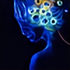 aeravi — earth frost

Published: 2006-12-14 11:02:36 +0000 UTC; Views: 787; Favourites: 28; Downloads: 1
Redirect to original
Description
earthy brilliancemy own photography and textures
Related content
Comments: 34

thank you 
what does this image say to you?
👍: 0 ⏩: 1

the pattern on the face seems to suggest looking at the child through a piece of lace...the eyes are outstanding...
i'm not sure it says anything profound to me...it is quite lovely to behold, a beautiful piece
👍: 0 ⏩: 1

Wow, how many of these did you make?
Hmm. This one could be even better than the other two!
i like the color, how the slight brown and the deep emerald work together to bring each other out. Then of course there's that lovely lace work that brings it all together.
My only suggestion would be tone the brown down a little bit to lessen the contrast between it and the pure white part. But other than that, it's wonderful.
Again, superb job...
👍: 0 ⏩: 0

this is awesome.
Normally I don't like photomanipulation, but this one is different, I love this work!
👍: 0 ⏩: 1

i try to approach photomanipulation like painting, and i use only my own photography, textures, and designs.
i am glad you like this image. part of why you might like it more than other photomanips is that the textures i used in it are all hand drawn with a pen on card stock which i then photograph. The dots are one drawing, the thin lines are another (both also used in [link] ). The teardrop lines are a separate drawing, also used in [link]
i love to hear that my photomanipulations cross boundaries and can apppeal to those who appreciate other art mediums.
👍: 0 ⏩: 0

The pattern you've used has such potential to be too bold in comparison to the young face, but you've used it wisely and to good effect. Such a bold statement at the same time with such brilliant eyes.
👍: 0 ⏩: 1

Fantastic piece here! I really love the design on the face! And the lighting is perfect!
👍: 0 ⏩: 1

Very interesting and sorta creepy effect at the same time. Excellent piece!
👍: 0 ⏩: 1

thanks! how is it creepy? the eyes?
👍: 0 ⏩: 1

I think it's the pattern over the skin, like a very bad skin disorder, I don't know how to explain it really, lol.
👍: 0 ⏩: 1

I like the slight green tinge, but I would make the green a bit paler, like a sage green. A bit more subtle, perhaps. And I'd down the contrast a little bit. Those are just my opinion, of course
The only setback with digital art is that there are so many options at the click of a button and it's hard to choose
👍: 0 ⏩: 1

i totally agree, and it's done. 
👍: 0 ⏩: 1

you're welcome, I'm glad I could help
👍: 0 ⏩: 0

very nice
i really like that creamy yellow color and this title fits it much better
👍: 0 ⏩: 1

I'm a bit lukewarm on this but I see a great idea.... the background layer could be the classic earth from space blue and white clouds..... get it?
👍: 0 ⏩: 0

beautiful <3
I'm really liking how you used texture on everything except the eyes for emphasis.
👍: 0 ⏩: 1


