HOME | DD
 TJUArt — The Deep

Published: 2010-12-18 17:50:32 +0000 UTC; Views: 2117; Favourites: 55; Downloads: 75
Redirect to original
Description
~ 3hrsBarely anything painted


Used This
Related content
Comments: 16

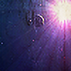
the planet doesn't really look round and the nebula looks too texture - like. Because of that I seems like low quality. Using textures is a cool thing, but smudge and overpaint them makes it even cooler! xD
BTW you work with PS right?
👍: 0 ⏩: 1

I'm making a update as we speak so that should probably look a bit better and no I don't use PS (gimp ftw 
👍: 0 ⏩: 1

No, I just asked because I use gimp, too and wasn't shure if you do it. But its really cool that another spaceartist with a high skill level uses gimp because otherwise, just beginners use it.
👍: 0 ⏩: 1

High skill level?!
Yeah, it kinda gives gimp a bad name when people only see crappy art straight out of a tutorial. Btw don't get me wrong, I understand that it takes time for people to learn (I mean look at some of these 
👍: 0 ⏩: 0

Pretty colours, but probably not your best in regards to the close planet especially, too "rough looking" I think. But I suppose not too bad for just a few hours work
👍: 0 ⏩: 1

Thanks, I might redo that close up planet, the main focus of this one was the starfield so is that looking acceptable?
👍: 0 ⏩: 1

Yeah, stars look pretty good. The dust texture over it could be a tad bit softer though, mainly around the sun where its most noticable
👍: 0 ⏩: 1

Hmm, maybe, I was kind of going for a more nebularistic (
👍: 0 ⏩: 1

Oh, if that's the case then maybe don't worry then
👍: 0 ⏩: 0

Rockin rockin ! Color use or abuse is wonderful 
👍: 0 ⏩: 0


