HOME | DD
 raviyn — jamboree

Published: 2012-01-22 00:34:44 +0000 UTC; Views: 1171; Favourites: 50; Downloads: 0
Redirect to original
Description
fullview!making my wayinto another world
~


 ~
~I dedicate this to each and everyone of you. You all are my inspiration.
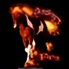
This is my newest (and first stally) character, Jamboree. We're friends. <33 Oh, and he ran away from the circus.


By the way, his neck is supposed to be like that. He can release scattered light (or whatever that's called).
So, ahem, I finally created something I deeply love! I poured everything I had into this. I hope it shows.
Very happy with the whole outcome. Thank you to those who stopped by while I screen shared! <33
Am I getting a little bit better at lighting? A touch maybe?
Enjoy.
~


 ~
~CREDITS
about 7-8 hours | 67 layers | photoshop cs5.1
horse sky background lantern
Thanks! <3
Copyright © =Kiska-Designs
Do not use in any form without permission.
Related content
Comments: 25

oh! I love the beam of light! Simply gorgeous!
👍: 0 ⏩: 1

Your welcome, I do love that manip.
👍: 0 ⏩: 1

I believe it's my best so far! I really hope I'm improving. ;D
👍: 0 ⏩: 0

Thank you! I had so much fun designing him.
👍: 0 ⏩: 0

Oooooooohhhhh. That is gorgeous! Too bad I wasn't around too see you work on this....
👍: 0 ⏩: 1

Thank you so much! <33 I hope you can come next time!
👍: 0 ⏩: 0

Thank you!! Did I get the 'wow-factor' effect I was going for or no? Be honest. x]
👍: 0 ⏩: 1

Yeah! I like the glow, I think you might have made it brighter? It really illuminates just the horse, and the background is more simpler with it being darker, the whole attention is on the creative design of the horse ^^
👍: 0 ⏩: 1

I really upped the contrast a TON, but maybe it should have been more. 
👍: 0 ⏩: 1

I didn't mean "Maybe you should have made it brighter" but more like, since the last time I saw it, it's now brighter and I like it.
👍: 0 ⏩: 1

Oh! Sorry, I misunderstood. xD
Yeah, before it was really grainy and dusty = boring.
So I added an orange tint and adjusted the contrast and lighting. If you look at the before and after, it's pretty extreme. xD
👍: 0 ⏩: 0

This is really good. I love the whole emotion in the manipulation.
👍: 0 ⏩: 1

Your very welcome, keep up the good work!
👍: 0 ⏩: 1

This looks amazing! I definitely think your getting better at lighting
👍: 0 ⏩: 1

Thank you! 
👍: 0 ⏩: 0


