HOME | DD
 nisht — duality

Published: 2008-01-28 19:23:50 +0000 UTC; Views: 4361; Favourites: 61; Downloads: 773
Redirect to original
Description
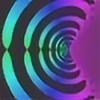
well,i saw something similar to this once on da and decided to give it a go,im redecorating my room soon,so i was thinking to maybe print it and but it on a wall,tell me what you think,its still work in progress.Related content
Comments: 19

NIIIIICE! this is my favorite in your gallery by far. but these people have it down. i would spereize the texture more and adjust the shading. like instead of having it even all the way around the planet, have the light coming from the two fractals a lot brighter and have the lighting a lot darker around the sides of the planet. but ya, you rock!
👍: 0 ⏩: 0

It's like a giant city planet... I love the two main colors of this picture!
👍: 0 ⏩: 1

I like it the planet should have shadow based on another light source witch would need to be to one side or the other... but beyond that it's awesome
👍: 0 ⏩: 1


👍: 0 ⏩: 1

Well I will certianly go and look
I found that using 2d to do space scenes to be quite frustrating (see my really old stuff) and it was mostly because it's near impossible to create correct shadows that are all coming from the same light source...
I use 3D now so when I do a space scene the light comes from the light source the same for all objects (whether they are planets or a ship) which tends to help, of course creating in 3d is much more difficult as the planets have to be UV mapped or they get 'swirled' spots at top and bottom ....
👍: 0 ⏩: 0

very very cool. i agree that the middle perhaps should be a tiny bit darker, but i dont think it really needs anything added like rocks or a ring.
and the good thing is if you get the shape of the darkening right that will make it look more spherical.
to be honest though it looks great at the moment. i dont think that in nessisary for you to change it at all. just possible things you could do
👍: 0 ⏩: 1

meu!thanks for the fav,and the advice,its kinnda hard to get the shadow right,been struggling with it for the past 30 min or so...and this is the first time im doing two parallel scenes that are quite simillar to each other and its causing a confusing state in my mind now...aaaaaaaaaa!!hihihihihihi
👍: 0 ⏩: 1

awwww well good luck!! im sure you can do it. its probably one of those annoying things that seems really hard until you get the hang of it, but not so hard after. 
👍: 0 ⏩: 0

You and your fractals. *tsk tsk*. Haha. looks great. The planets are very (dare I say it) d0ckettes-like. Nice and sharp, and the cities are very eerie. Nice work.
👍: 0 ⏩: 1

planet*..yes there is only one.
👍: 0 ⏩: 1

oh thanks!!! i got hooked up on fractals big time!guess the lack of inspiration for making nebulas is kicking in with a dose of inspiration for fractals!actually im considering to change the fractals rendered better ones for stuff like this,ill send something later today,so stop by and check it out!cheers
👍: 0 ⏩: 1

I'll make sure I do. Unless of course that's one of the five devations in my watch right now.
👍: 0 ⏩: 0

wow, nice 

but its great job man
👍: 0 ⏩: 1

meu!thanks fot the advice,ill try and work out something,was thinking maybe to put some planet rings or floating rocks,to brake the monotony of the middle part.
👍: 0 ⏩: 0

hey,thanx for the suggestion,ill get on it right away.
👍: 0 ⏩: 0

in my opinion the middle (vertical ^^) is a lil bit boring... you could make a bevel with this colorgradient
👍: 0 ⏩: 0


