HOME | DD
 mortalitas — Dark disco

Published: 2005-11-12 06:45:57 +0000 UTC; Views: 1783; Favourites: 24; Downloads: 306
Redirect to original
Description
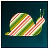
[link]More of this vector style for deluxe one. Not sure whether to develop this sort of style further, as ive done several peices for depthcore and one for oxygenetic so far. Id love to hear your thoughts on the matter.
-Updade- Print now available**********************************************
Related content
Comments: 18

yes stick with this style i love it,get it going :] your awesome at detail mang
👍: 0 ⏩: 0

definalty take it further. i like this one more than the pink bacground ones. I guess its the contrast. Amazing stuff definalty keep it up.
👍: 0 ⏩: 0

too dark, I first tought it was a photograph, taken fom a picture.
👍: 0 ⏩: 0

I seriously think you should keep doing this. I love how it looks minimalistic yet theres a massive amount of detail in the shapes.. god i love it.
👍: 0 ⏩: 0

Definitely worth developing. I think you just need to get the backgrounds sorted.
👍: 0 ⏩: 1

for this peice i wanted to keep the bg simple so it doesnt distract from the shapes, and i kept the contrast low, to get a bit of atmosphere to it. what background do you think suits these sort of images?
👍: 0 ⏩: 1

I would have thought that you could keep the basic background colour the same, but work in a lighter tone gradient.. maybe lowering the opacity a bit if the contrast seems too great. I also think fading in a bit of grain in the background would push up the main forms too.
👍: 0 ⏩: 0

GReat style man. I love the details.
though i think you should contrast it more ..
👍: 0 ⏩: 0

Beautiful detail!
It could use way more contrast though!
👍: 0 ⏩: 0

You need to develop this style man, it is looking great so far !
It got details, enough sharpness and eye-candiness too, i'd consider it as a result from your experimenting period.
Keep it coming
👍: 0 ⏩: 0


