HOME | DD
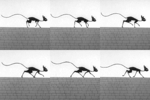
 MerianDenham — Perilous Perambulator

Published: 2018-06-22 10:37:47 +0000 UTC; Views: 568; Favourites: 24; Downloads: 1
Redirect to original
Description
Another pencil illustration involving 1920-30s artifacts and some nightmarish, unnaturaly carnal menace.Related content
Comments: 12

👍: 0 ⏩: 1

Muy amable, gracias por comentar!
👍: 0 ⏩: 0

👍: 0 ⏩: 1

Right! In fact, too many organs are completely overrated.
👍: 0 ⏩: 1

👍: 0 ⏩: 0

Haha whoa, that's a menacing monster with a pretty clear weakness
👍: 0 ⏩: 1

I guess it has to move in extremely quick steps to avoid falling down, which surely increases the already comical appearance. Nevertheless, it's a dangerous killing machine. I think.
Anyway, my monsters in this series are a little too exposed to broad light to be really frightening. But I just don't want to mess with detailed environments and big masses of black or gray. The purpose has been fast sketching to combine two figures (a 1920s era element and an odd looking creature) and try to keep it clean and lively.
👍: 0 ⏩: 1

Yeah, and I don't see anything wrong with keeping the monsters a little goofy in this way. Showing them in bright light makes them sort of funny and clumsy, which is really refreshing.
👍: 0 ⏩: 0

Thanks, I guess it is. I would have preferred it to be terrifying, but too much light and fast desing prevented it.
👍: 0 ⏩: 1

I think the quickest fix to shifting the tone toward the terrifying is to turn the white background to black
👍: 0 ⏩: 1

I did try exactly what you suggest in my last drawing, but it felt a bit fake to me. I mean, the background could be physically darker but that didn´t translated into a more somber or sinister scene. It kept being a neutre / blank nothingness, not a shadowy environment. And black or deep grey background tended to jump out of the screen competing with the characters... and, besides, the series i'm drawing is already fixed on white or light grey backgrounds. So I decided to let it go.
👍: 0 ⏩: 0


