HOME | DD
 krush — BB I

Published: 2003-08-06 22:09:51 +0000 UTC; Views: 1635; Favourites: 14; Downloads: 417
Redirect to original
Description
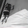
just a serie of 3 shotsit's a portrait serie with a friend of me ...
Hope you enjoy it people !!
--
Full view recommended !!!!
Related content
Comments: 51

How many times I tryied to do this alone and I wasn't suceed.. damn..
Love all that emptyness in the person and the background..
love all the concept and the way ya elaborated it.. maybe with a better camera you would get less noise, and a bit more of sharpness on the person..
👍: 0 ⏩: 1

now I have a better cam, it's an old deviation..
Glad you like it !
👍: 0 ⏩: 1

Whitch camera do ya have now?
I had a crappy Minolta Dimage XT.
I have now a Casio Exilim Pro 600 for about a month.. but I'm facing a 'non creative face' .. I've not been able to do a good job
Keep it up
👍: 0 ⏩: 1

Wheeee...cool enough to be a CD cover. Very Very mysterious. And beautiful colors.
S.
👍: 0 ⏩: 0

really like the fact that his face is dark
looks interesting but creepy in a way
well done mate
👍: 0 ⏩: 0

Good work, nice concept. It's a little bit hard to see exactly *what* it is, but it's very cool nonetheless.
~James
👍: 0 ⏩: 0

this would make a great advert in a magazine or poster
👍: 0 ⏩: 0

that's nice- i like how the red and white stick out- and the faded reflection.
👍: 0 ⏩: 0

Great lighting here. The reflection is great, and the lack of a visible face is awesome!
👍: 0 ⏩: 0

again a awesome shot
i love that kind of photos, like the red and the black mmm... awesome
👍: 0 ⏩: 0

oooh its totally spooky! looks like darth vader or something. i love the amount of texture on the clothes.
👍: 0 ⏩: 0

This is awesome! The choice of colors are just great! The shadows, what is *not* there, adds to this photo greatly! Great work!
👍: 0 ⏩: 0

great work, really nice.
..did you fake the reflection? i think so, in PS ....
👍: 0 ⏩: 0

i love it!

👍: 0 ⏩: 0

Fantastic shot, colours, model and mood!! I love it!!
👍: 0 ⏩: 0

Have I told you before that I love the things you do with negative space? Well, if I have, let me say it again 
👍: 0 ⏩: 0

Just looking at your gallery one more time, and just found this one - damm that's a awsome picture, don't find the exact words for it - great
👍: 0 ⏩: 0

i... don't like this one as much as the other one 
👍: 0 ⏩: 0

beautiful contrast and colors. again, great light.
👍: 0 ⏩: 0

i dont know if i like the mirrored image under him, or the way it feels a bit pixelly or something..
i do really love this tho
im such a sucker for hoodies
he needs a hug
id like to see the original of this
anyway
much love
👍: 0 ⏩: 0

oh this one is amazing i love it well done.. the 2 colours really aw magnificant.
👍: 0 ⏩: 0

Gorgeous... This shoy is stunning, I love the composition and the model... Stunning! 
~Mergana~
👍: 0 ⏩: 0

ditto to everything thats already been said, except for all the stuff about the reflection, it kinda ruins the composition (from my point of view). the choice of colors hold this up doh.
👍: 0 ⏩: 0

ooh great shot, i love that u can't see his face, keeps it mysterious. full view is kind of blurred, though. not as crisp as i'd like it, but then again maybe it was intentional. off to see the second one now.
👍: 0 ⏩: 0

I love this. I love the simple colours and the overall picture, it's unusual where he's positioned on the page but it works. It works well. Love it.
👍: 0 ⏩: 0

Great shot! I love the lightning and the sharp colors.. I too wonder how the reflection was made..?
Had this been a little sharper/more focused I think it would be just perfect! But a great job as it is too.. Keep this up!
👍: 0 ⏩: 0

EXCELLENT! Very nice, very interesting idea! I like how it's whole body fade in the dark, letting just his clothes appear. Add some kind or dark message, or mysterious effect to the image.
Is the reflection real, or is it a manip?
👍: 0 ⏩: 0

That's some fat shit right there... Keep up the good work
👍: 0 ⏩: 0

This is a very well-executed portrait. The colors and light are wonderful. Great job
👍: 0 ⏩: 0

This is quite a cool piece of work. Wondeful use of color, contrast, and negative space. The reflection makes the whole piece very striking.
👍: 0 ⏩: 0

*blink*
Woah, this is so cool. The bright red and white, with the refelction on the black floor. Its just so smack-you-in-the-face-look-at-me type of picture.
👍: 0 ⏩: 0

Hey... nice piece, man... I like the sharp red... A nice addition to your gallery.
-absolute halo-
👍: 0 ⏩: 0

ok, i'll guess my comment will be real original :-s
yeah, like the reflection, a lot, like everyone on here...
I don't know why, but watching this pic, made me think of an e-blood clothing add or something... whatever... nevermind
👍: 0 ⏩: 0

Great work with this.. I love the use of the negative space.. and the dim reflection.. cool work.. !!
👍: 0 ⏩: 0

I really like this, the color, ad the feel of isolation created by the contrasts, the reflection really builds this uninterupted lonliness... I like it alot
👍: 0 ⏩: 0

Nice!
I have also seen this reflection effect by x-horizon, what do you do exactly to achieve it?
👍: 0 ⏩: 0


