HOME | DD
 jollyjack — Super Pretentious

Published: 2014-12-05 10:24:39 +0000 UTC; Views: 234125; Favourites: 7224; Downloads: 20834
Redirect to original
Description
“Our new logo is symbolic of everything we believe.”
“We love it because people might not get it right away”
Yeah, try saying that during a pitch in the real world and keeping your job.
Related content
Comments: 3021

👍: 1 ⏩: 0

👍: 0 ⏩: 0

👍: 4 ⏩: 1

👍: 0 ⏩: 0

👍: 2 ⏩: 1

👍: 1 ⏩: 1

👍: 1 ⏩: 0

👍: 1 ⏩: 0

👍: 2 ⏩: 2
👍: 2 ⏩: 1

👍: 3 ⏩: 0

👍: 1 ⏩: 0

👍: 8 ⏩: 0

It has been five years since they launched this logo, and I'm still calling the “New” logo complete garbage, and I wish we still had the old logo. Sometimes when you try to “fix” something, you only end up making it worse.
👍: 4 ⏩: 1

👍: 4 ⏩: 1

👍: 3 ⏩: 0

Five years and I'm still calling the "New" logo complete garbage and I wish we still had the Icon
👍: 1 ⏩: 1

we call DA eclipse garbage too
👍: 0 ⏩: 0

To this day I still find this new DA icon to be ugly and I still can't believe artists, some who were obviously asked by the staff to draw their logo in a positive light, praised the new icon with their pictures. Sell outs....
👍: 2 ⏩: 0

I just realized something. The symbol means something! Deviant Art went Nazi! Lol. Jk.
👍: 0 ⏩: 0

This comic made me miss the old logos, which I see tells and represents DA way better, than this z thing.
👍: 0 ⏩: 0

I still hate the logo. I will never accept it. To me, it's just an atrocity that is apparently encouraging more artists to create their own watermarks rather than have this abomination on their work.
👍: 0 ⏩: 0

It's even a crossed out "z" which adds a negative effect...
👍: 0 ⏩: 0

Sunny: Buuuut, "here" is not the standard to which the rest of the universe must conform.
Eile: Yeah, especially considerin' logos like the Nike Swoosh.
👍: 0 ⏩: 0

Gotta love how the DA staff actually chose to remove this sketch from the 'What's popular right now' page when it got 1500+ favorites/8000 views in under one hour after the update.
R.I.P. in peace zeviantart.
👍: 2 ⏩: 0

I miss the old DA logo... has it already been a year of this...?
👍: 0 ⏩: 0

Ah, this comic still makes me laugh. In my Visible Language class I'm presenting the current dA logo as an example of a bad one: confusing and inaccessible.
👍: 0 ⏩: 0

In few hours, it will be a year since this abomination was theatricaly introduced. I think I am even angrier about it with the passed time. Also, to the list of "it looks like [anything but da]" I'd like to add a jigsaw piece and an evergreen twig.
👍: 0 ⏩: 1

it still blows my mind, i can't even remember which letters were supposed to make the Z. for me it's not just another bad logo amongst many.
👍: 0 ⏩: 1

I know, right? I just look automaticaly at the "DEVIANTART" writing they had to add next to it.
👍: 0 ⏩: 0
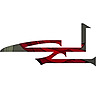
To tell the truth, the first time I saw it, I thought it was a cut-up "≠" symbol.
I actually would have liked the idea of using that symbol and combining it with the starting letters of DeviantArt somehow.
As if saying "DeviantArt ≠ normal art", you know?
Oh well.
👍: 1 ⏩: 0
Look, up in the sky!
It's Newgrounds!
It's 4chan!
No, it's.....
DEVIANT MAN
👍: 0 ⏩: 0

Yeah, let's make it confusing, to help brand recognition!
It's one thing to cleverly take advantage of negative space, and another to make it so unreadable that you need to write "deviant art" next to it in a funny cropped way as well in an attempt to explain the logo next to it. And even that's not working as they think it is, because the way the top right and bottom left corners of the logo are cut, plus the middle bit of the "A", make the Z's diagonal oblique line appear to be at a different and unrelated angle to the one in the "deviant art" spelling.
👍: 0 ⏩: 0
| Next =>


