HOME | DD
 gracefulsunshine — Aerlian

#malewitch #aerlian #animeboy #witch
Published: 2018-11-03 08:44:20 +0000 UTC; Views: 1649; Favourites: 180; Downloads: 0
Redirect to original
Description
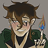
they calmly weave their magic, their birthright — and feels the petrified bones beneath the soil clamoring for freedom, the infinite stars, the shimmering aurora in the cold night.their journey will not end here.
[19/11/2018: made a few tweaks. thank you to everyone who took time to give me constructive criticism- it's very appreciated!]
when a self indulgent, non-AA art turned into a pain in the ass LMFAO but i'm glad i was able to finish this! been a while since i've done art where i'm nevertheless content about the final product, so i'm hoping this will stand the test of time (unlike ataraxia, yikes).
will probably be drawing this disaster child more often in the future, with even more tweaks to their outfit alskdfjh
process GIF can be found here | cross-posted on twitter (i'm on twitter more often nowadays; feel free to find me there!).
Related content
Comments: 41

Hey! Great work with the colors, especially the blue. I can see that you have pretty solid knowledge of light/shadow etc. Definitely keep up the good work! The only thing I'd say is that you should work on some anatomy. His arms look to short and the shoulders are to small for his face/neck etc. If you wanted to make him look a little shorter you should make sure that the proportions are right! If you work on that your art should gain a lot more attraction!
Best regards
👍: 0 ⏩: 0

I really like the shading and the character's design! It's a beautiful artwork ~
👍: 0 ⏩: 1

aaa thank you kindly! i'm glad you like it c:
👍: 0 ⏩: 1

I agree with pudcup on this looking very busy. Don't underestimate the power of low-detailed areas as a means to guide the eyes of the viewer. In this, the largest undetailed areas are on the cloak and the face, causing the background to draw more attention to itself than it should. I really love the bird skull element on the hat but the character's face is very generic and unmemorable and the picture doesn't draw you in to concentrate on the face. The composition might also be less than optimal, but it's hard to say because the background repeats the same colors as the character, so there is no real negative space to balance out the character.
👍: 0 ⏩: 1

hi there! i've tried to address your comments with a few updated tweaks and some of my own thoughts below.
i originally added so much debris because i was looking at the composition zoomed out (considering this is 5100 x 3300 px at 300 dpi), but i do recognize that i didn't erase enough of the debris -- so it gives off that cluttered effect when zoomed in.
with regards to the cloak, i see what you mean about the it not being as detailed as the rest- it's a bit jarring. i plan on adding a clasp of sorts for the cords to his character design in the future so that it balances out the blue. i originally attempted to add textures to the cloak but it clashed with the particles overall, and added stars on the bottom in the end.
i surmise that your opinion of my character having an unmemorable face is in parts because of the lack of expression and the face being overshadowed by the other details? i'm not sure what your standards of having a memorable face would include, but i ended up adjusting his eyes to another hue i was considering for a slight dissonance- since the original eyes blended a bit too well with the rest of the colour scheme.
anyways, thanks for the feedback! i hope i've touched on the more salient points you've brought up.
👍: 0 ⏩: 1

The face is rather symmetrical and no part stands out as being disproportionately large or small. There are also no scars, wrinkles or blemishes. I understand that the chosen art style is simplistic. I'm not sure if it counts as anime style but my experience of that is that faces tend to be very formulaic and characters are mainly identified by their hair, clothing, and color palette.
👍: 0 ⏩: 0

Wow I can't really give you much help on this piece since it's way too advanced for me haha
but I can still point out how amazing it looks O: the golden flakes and the colours all go together so beautifully but also sorta mysteriously. It's an amazing piece of art and was done wonderfully.
and If I am really trying for advice, the pinky finger on his left arm (one without the stick) is a bit awkward, like too short. I'm not sure if it's bent and if so maybe make it more obvious? I dunno
ProjectComment
👍: 0 ⏩: 1

no worries, thanks for commenting anyways! any sort of feedback helps c: i ended up adding a bit more thickness to the folded part of his pinky to show that it's folded and not ... cut off LOL
this piece was incredibly self indulgent, palette wise, so i'm glad you enjoy the colours and splashes as gold as much as i did
👍: 0 ⏩: 1

The use of shading really helps to make this piece pop out and the contrasts between the lights and dark really help to break down the form.
To improve I think you might be able to give a bit more definition to the planes of the face as this is probably the one place that seems a little flat.
I really like the texture that you gave to the staff and the shape you gave it is very organic as well as the colours that you have given applied to it.
The forshortening on his right hand seems to be a bit off, however I appreciate that hands are incredibly tricky and combining that with forshortening results in something that is very hard to nail down.
The extra details that you gave to his design really help to elevate this piece and help to tell a story about the character without having to read anything about him.
Overall I really like this piece turned out, keep it up!
👍: 0 ⏩: 1

hi- thanks for taking the time to give feedback! i hope i've addressed the points you've made here-- i touched up on the shading of his face, especially around the lower part of his face since it did seem kind of stale when you mentioned it. the arm and hand were indeed hard to get right, proportions wise, but it's a step in the right direction.
i'll do my best to keep your words in mind for my future works; thanks again!
👍: 0 ⏩: 0

Hi! Attention to detail here is lovely, however the piece seems very busy. There's many loose particles flying around, and I think it could benefit from less particle usage. Also, I think the head is a bit too narrow. You can see his left eye poking out of his skull from just beneath his hat. My suggestion is to move both eyes inward slightly to fix the eye issue, and widen the jaw a bit, just to give the inside of his mouth some space. Overall, the shading looks really great, and I love the detail in the staff and clothing. Great job!
👍: 0 ⏩: 1

hi there, thank you for the feedback! i wasn't able to fix his mouth without making it look weird for me, but i do agree with your comment about his left eye and the amount of loose particles and tried to address everything else.
i'll do my best to keep what you've said in mind in the future; thanks again!
👍: 0 ⏩: 0

Oml howww! The detail is amazing. The shading and the backround is just AHH!
👍: 0 ⏩: 1

Wow! This is a very beautiful picture. I like the golden look on his clothes ~ And the dark colors look very mysterious. You did a good job working on this art. I wish you success in the future! You are very beautiful draw
👍: 0 ⏩: 1

thanks for the kind words! i love gold embroidery and foil against dark backdrops and i'm glad you enjoyed it as well <:
👍: 0 ⏩: 0

This dude has style, i bet he knows how to party!
👍: 0 ⏩: 1

he does his best! probably better off with those dainty tea parties than a weekend rager lbr
👍: 0 ⏩: 1

Tea parties are legit!
👍: 0 ⏩: 0

thank you! glad you like it <:
👍: 0 ⏩: 0

//wheezes heavily over that palette
that's so gorgeous, bless indulgent art to the MAX
👍: 0 ⏩: 1

wheezes over you
thanks so much silve! smooches eheheheh definitely glad to have this over with though-
👍: 0 ⏩: 0

dang dang this turned out super cool??????!!
NICE PLANTS
👍: 0 ⏩: 1

I JUST WANT THE SUFFERING TO BE WORTH IT HGHDFJSKDFJKSDF TYTY
one day i'll be better at plants!!!1
👍: 0 ⏩: 1

as long as we’re collabing you’ll have many plants to practice with ahaha...have fun!!!
👍: 0 ⏩: 1

steals his hat and hands it to you on a platter it just adds 3" to his 4' 9" frame or smth
👍: 0 ⏩: 0

If you find out I wanna know too!
👍: 0 ⏩: 0


