HOME | DD
 FG122 — Plotting...

Published: 2016-10-11 01:09:24 +0000 UTC; Views: 181; Favourites: 6; Downloads: 0
Redirect to original
Description
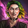
A damaged villian contemplates her next move...Any critique?
Related content
Comments: 8

Hehehe, I love scenes like this!
The evil figure takes a blow, but no matter; the war is not over, so she carefully considers her best method of counter-attack.
👍: 0 ⏩: 1

Omg yes! Thanks for commenting and faving! Every comment means a lot to me~! I was really proud of this one too~
👍: 0 ⏩: 1

Of course! I don't know enough about drawing to properly critique this piece, but I enjoy villainnesses very much, and your style as well.
👍: 0 ⏩: 1

Dat hair shading thou!
I love seeing how much you have improved over the years that I've known you. It inspires me to continue with my own artwork *kisses*
👍: 0 ⏩: 1

Omg thank you so much~ *hugs*
👍: 0 ⏩: 0

I don't mean to be a shit in any sort of way- Just wanna help your with some of your shading and proportions- After you add shadows I recommend adding some paler colours in the centre and then blending, Like on the chest piece, the gloves, the yellow diamond looking thing, and the hood (I think it's a hood? The white puffy thing) if added some paler parts could add to it, make it look not as flat? I also recommend adding shading to the grey thing (Table?) under the character and towards the foreground to make it look not as flat. The bottom of the chest piece could do with a little bit of a shadow on the bottom and a shadow where the right hand is in front of the mouth would create a shadow on the chest piece. The left shoulder seems to also be not sticking out as far as it should unlike the other shoulder compared to the rest of the arm. The right hand's pinky finger would poke into the glove seeing how far in it's curled so the fingertip would probably poke into the glove instead of traveling up the side of her hand and wouldn't be too visible. Over all the hair is nicely done and the face shows a good enough amount of emotion. Hope that helps you a bit there- I tried XD
👍: 0 ⏩: 1

Omg thank you so much~! I'll go make adjustments when I get the chance ^3^
👍: 0 ⏩: 0


