HOME | DD
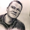
 akarudsan — Barabara Palvin painting

#portraintpainting #oilpainting #painting #portrait #portraitbeauty
Published: 2019-02-10 17:25:19 +0000 UTC; Views: 456; Favourites: 64; Downloads: 0
Redirect to original
Description
Facebook || Instagram || Reddit || BuyMeACoffee || AlexeiArt YouTubeOil painting done today as a part of our weekly workshop...it's just instead of normally using charcoal I decided to go with the "hard" stuff and went with oils


 It's only three colors and I might adjust it further but it came out ok and I've learned a few more tricks with oil paints by accidents...I guess I need to read more on the topic to learn more stuff instead of just accidentally discovering them (which is still good and ok).
Other work:
Related content
Comments: 15

g r e a t . w o r k . v e r y . e x p r e s s i v e .
👍: 0 ⏩: 1

Looks very good. It's difficult to turn a form with color alone.
After getting the hang of values with charcoal (light and dark), the next thing of which to think and take account is warm and cool. Good way to do that is to work with two colors - burnt sienna and some kind of complementary blue. Use the first for the light (warm) areas and the second for the dark (cool) areas. Mixing the complements with white and black (tint and tone) will produce the mid tones, which will be "colorful" grays.
Can't tell for sure on my my monitor, but it looks as if you may have done that, here using cadmium orange/red and some kind of green?
👍: 0 ⏩: 1

It's the shine of oil which doesn't allow you to see what colors I've used. The whole painting is done with two colors: Titanium White and Burnt Sienna. and very little bit of Ivory Black on eyes for very dark tones mixed with Burnt Sienna.
👍: 0 ⏩: 1

thanks. Yeah, I often can't distinguish between black and green at low intensity. I have a sweater that I think looks green and I'm told is black. Also, had a black and gray tabby cat that, to me, looked greenish.
Try the warm/cool approach with complementary colors with black and white. Just tiny thumbnails to start. From one color to two colors - and with a goal and a plan.
👍: 0 ⏩: 0


