HOME | DD
 nedashi — Lypz

Published: 2008-08-11 18:46:08 +0000 UTC; Views: 1798; Favourites: 26; Downloads: 14
Redirect to original
Description
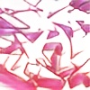
Heyyy you guys asked for graffiti so heres my attempt. *hides her face in shame. It'd be nice to get some pointers n tips n advice from all you who are so experienced with this since I know nothhhin!!! <3Related content
Comments: 94


P.S.:I haven't forgot about our trade, just so you know. It's just I had this to solve in my life, once I can concentrate on art the way I want, you'll get it.
👍: 0 ⏩: 0

reaally good 4 ure first, most people i have tried to teach suck...but this looks like you have a lot of potential that is just waiting to be tapped in to and make awesome pieces because i know you have it in you especially cuss you have that awesome style of yours...
👍: 0 ⏩: 0

Aight, there's some pretty solid pointers all in all, so I'll try not to reiterate too much on what's already been said.
As far as varying thickness of letters go, try to imagine that the piece has been written with a calligraphy pen held in a constant angle. Then, the lines that travel up/down and to the left may be very thin while those traveling up/down to the right will be very thick. And experiment from there... they don't all need to follow the same rules, just whatever looks good--graffiti really is a free-form art. Don't find yourself following rules and standards... you can make anything look good.
Sempai had a great tip in starting to design letterforms with hand-styles/tags. It takes 5 seconds to quickly write a tag and 10 minutes of experimenting with different letter structures and flow will really help you visualize the full-on piece when you get around to it.
The depth of your piece is very linear. It's quite obvious that when you were done drawing the L, you moved on to the Y. When you were done with the Y, you moved on to the P... Try drawing the outline for each letter lightly, and let them overlap (much like you would draw the skeleton in one of your characters). Then, pick and choose the parts of each letter that should be on top--this is where you need to think about what each individual letter needs to stand out. As is, that Y looks like an H and the Z looks like another L.
I only partially agree with what was said before about the source of an extension. Yes it needs to LOOK like it is coming from somewhere, but I know many writers that add extensions because the shape of the extension adds to the overall shape of the piece but on closer inspection you will see that it doesn't really connect to anything. The trick there is to hide it behind a solid chunk in the piece--don't have an extension lead behind another line to disappear into white space. Your arrow on the left stayed consistent behind the L but disappears when it hits the Y.
Keep playing with these letters. If Lypz is what you're thinking about writing, it has the potential to be a very solid and wild letter-set. One thing you may find is that you can only do so much with letters like L's Z's and (sometimes) Y's. I've found that the more complicated letters like B's and R's are a lot more dynamic. Hell, I gave up on writing ~LMNtL because it just got too frustrating.
Hope it helps. You'll be amazing at this before you know it.
👍: 0 ⏩: 1

Jezus christ. That was the most useful piece I've ever read. I think you deserve a tip. Haha. I really appreciate it. I totally understand what you're saying and thanks for taking the time to do this for me. Problem I got is tryina stylize letters so that they're readable yet at the same time the entire piece is balanced. I suppose it just takes more and more practice to get that right. Thanks for the pointer on the name, I'm really thinkin bout that one too. I suppose I should try n keep it simple, and try to make the letters readable haha. Thank you thank you and thank you again. Really appreciate it.
👍: 0 ⏩: 1

"Problem I got is tryina stylize letters so that they're readable yet at the same time the entire piece is balanced" lol... I think you just said what every single graffiti writer thinks every single time we set out to design a piece.
👍: 0 ⏩: 1

Wow! This is incredible for your first time. Like the guy above me said, you could work on your thickness of the letterforms, try to keep it consistent. Other than that, it looks perfect.
👍: 0 ⏩: 0

i guess one of the things you should pay more attantion to is to variate the thickness of the letters. if you want to add a arrow that jumps out of a letter you should make it clear that its not directly a part of the letter. and try to keep a balance. dont make like one very thin letter and the other ones big.
hope this was helpful
👍: 0 ⏩: 0

this is actualy pretty cool, and u were so afraid to do it, i not sure if this will help but check [link] they have some cool graffiti vids.
👍: 0 ⏩: 0

awesome!! great job, looks old school. the only thing, as people have already stated, some 3d would look good. Id go for a down wards 3d in one point perspective.
so like, take all the bottom corners of the letters and draw equal sized lines aimed at a dot, placed somewhere beneath the piece. then turn those lines into boxed matching the flow of the letters.
if that didnt make sense, let me know and ill upload an example.
👍: 0 ⏩: 2

Naww I gotchu. I'm actually not too bad with perspective to be honest. <3 But if you wanna show me an example that'd be cool too. Thanks sooo much~
👍: 0 ⏩: 1

Hmmm, I drew an example, but my scanner doesnt seem like it wants to work...
ill get back to you haha, worst canse scenario, ill just take a pic
👍: 0 ⏩: 1

ps thanks for the favs once again!
👍: 0 ⏩: 0

I asked to join a character battle, CMONNN.
👍: 0 ⏩: 1

yes yes, character. but WE want to see you in a WORD battle now. after seeing this theres no excuse
👍: 0 ⏩: 1

WHAT! You guys are crueeeel. I... Lol. Guess it wouldn't hurt. I'd be forced to try and not get my ass kicked. Am I allowed to incorporate a small character/images with the lettering?
👍: 0 ⏩: 1

hmm...NO. jk. maybe you can incorporate them INSIDE the piece. that would be interesting. heres what you do. so theres no pressure, next time we throw some open battles up(which may be a minute, we a srsly SLACKIN rite now.) if you see any you like jump in. no pressure (BUT YOU BETTER!...jk)
👍: 0 ⏩: 1

Ya cruel bastards.
👍: 0 ⏩: 0

I'm Serious! This is really good for first time, aiight?
👍: 0 ⏩: 1

you already have a decent swing with your letters. I'd say watch your spacing. The upper part of the Z is behind the P. you could have had that letter come out from behind. the extra arrows you added maybe overloading the piece for what it is. so drop those. Begginner s often go arrow crazy. Less is more keep it simple at first it's not like you need to bust out wildstyles in the beggining. DO handstyles and base your pieces off those, like how the artform actually developed.
[link] this is a mad basic tut but it gives you a jump off point if you want to write.
👍: 0 ⏩: 1

Heyyy I really appreciate the comments. I'll check out that tut. Take your advice n keep goin with it. Thanks.
👍: 0 ⏩: 1

with what sempai said withe the z also works with the y. the bottom may want to over lap. Its hard to tell where the y ends ( i hope that makes sense). hit me up if i dont make sense. I think it may look a lil better with out the pink arrows. they seem to take away from the letters a bit.
I do have to say this is very good for your 1st time out. Stick with it. Maybe join a battle to push yourself.
👍: 0 ⏩: 0

(In a snooty british accent)For I believe this is a majestic piece of art.....hip hip
👍: 0 ⏩: 1

i'm not even a n00b graffiter, so no points from me, i will only say that i like this a lot, and if this is your first try i can't wait to see your words in a couple of months
👍: 0 ⏩: 1

If you wanna be good on drawing graffiti then get a magazine called graphotism there are some really cool graffiti artists that are kick ass seriously but the magazine then learn from it thats what I'm doing.
👍: 0 ⏩: 1

Oooo I will check that out. Thank you.
👍: 0 ⏩: 0

definitly needs a 3d or a shadow but overaly nice outline + coloring
👍: 0 ⏩: 1

For someone who doesn't write graff alot... this is AWESOME. It looks really good! Only thing is maybe some 3D like facelessdrone said, but thats it, really good
👍: 0 ⏩: 1

Heyy Vipaaa. Thank you!!! Having you say it's awesome means a ton. I will try that 3d on my next piece.<3
👍: 0 ⏩: 1

yea you shouldnt belittle yourself this is really good... i wish i could write this good and trust me, ive tried >_<
👍: 0 ⏩: 1

Awhh. Thank you. I'm sure you can write.
👍: 0 ⏩: 1
| Next =>


