HOME | DD
 Minkymy — Trouble is a friend

Published: 2010-12-27 17:18:33 +0000 UTC; Views: 1785; Favourites: 16; Downloads: 117
Redirect to original
Description
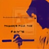
This is a sketch/drawing/whatever I drew one day after many hour or longer looping sessions of Trouble is a Friend by Lenka and watching the music video. I personally think it looked best in it's pure, unscanned formed, but this is my second favorite version. The girl is not my best completed human, But I kinda like how she came out.This is in digital art because large amounts of cleaning and retouching were done in MS Paint, and the contrast was increased in MS Word.
This, as you can see, is rather pixely. When all you have is a scanner that doesn't do things just the way you want them, a super simple art program, and a word processor that edits images, you take what you get.
Y'know, if people like this enough, then I'll submit a version with less contrast.
EDIT: EGADS! People have been FAVORITING THIS THING! However, I'm not getting enough crits. Thus, I ask that you please, PLEASE leave a constructive criticism type comment on this before you fave it.
Related content
Comments: 20

you are welcome 
👍: 0 ⏩: 1

Is "hihi" laughter (heehee) or Hello twice?
👍: 0 ⏩: 1

The girl turned out real nice I think. And the scan looks fine, the pixellation is pretty minimal and it's not distracting at all.
👍: 0 ⏩: 1

Really? You mean it?
I thought the girl looked really bad.
👍: 0 ⏩: 1

The only thing about the girl that looks off is the arm--I'm guessing her arm is bent at the elbow but it's kinda hard to tell. Otherwise the proportions look good to me
👍: 0 ⏩: 1

Oh, thank you! Yeah, I really wanted the shadow to stretch out behind the girl, looking bigger and more powerful than she is.
Now that I think about it...
I think She used to be standing on a surface, and that is what the shadow was being projected onto. Either I decided to drop it, or all the shrinking to a presentable size removed it
👍: 0 ⏩: 1

Yeah, I always find background tedious. Whenever I actually sit down and focus on them, I lose the will to focus on the subject...
👍: 0 ⏩: 1

Especially if you're putting 90 percent of your work into the background.
👍: 0 ⏩: 1


