HOME | DD
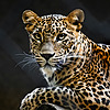
 BeckyKidus — [Art Trade] Cheetah - Spots and Speed

#artwork #big #cat #chasing #cheetah #colored #detailed #drawing #fast #hunting #illustration #pencil #photorealistic #realistic #running #speed #art #beckykidus #hyperrealistic #traditionalart
Published: 2024-02-09 20:49:22 +0000 UTC; Views: 22569; Favourites: 587; Downloads: 0
Redirect to original
Description
It's an art trade! And a cheetah! 
Of all the larger cats, cheetahs are probably the ones I have drawn the least. Most of them tend to have a sad expression I'm not really fond of drawing, and so it's hard to find references. I have still found some, and this was a great excuse to finally use one! 
Trade with The-Long-Feline . His part:
Prints, pillowcases, phone covers, notebooks, etc. can be found in my Redbubble store: www.redbubble.com/people/Becky…
Reference photo:
unsplash.com/photos/cheetah-on…
Colored pencil, A4, probably around 20 hours.
Please do not repost, claim as your own or use in any way without my permission.
Handy stuff:
List of all my tutorialsThe complete list of all the tutorials I have written/made - at least the ones still worth sharing, as some are really old at this point. It just got so hard to find them after a while, and there are so many - so here we are. A complete masterlist.The tutorials are not in chronological order, but rather in (a more) logical order Some of them are rather old, so the formatting may be off - or the quality lower. I've still included the decent ones, though, and they may serve as an example that writing tutorials also is a skill you improve in as time goes on and you do it more. ,Rambles about being an artist, and typical Artist Problems:Typical Artists' Problems, and how to defeat them (a free pdf booklet which answers all the common questions. Includes improved versions of all the articles below)Unfair comparisons and being your own worst critic A word or two about practice and practicing art Some about talent, skill and marketingSome about finding your own drawing style Artists and social media The "right" way to improve We all start out as beginners Creativity, imagination, skill and art Materials vs skill Perfect art and sketchbooks Quick list of tips on how to improve your art Tutorials about drawing (parts of) animals:The (I hope) complete guide to drawing animal eyes How to draw animal ears Tips about how to draw animal paws/feet/hooves How to draw realistic (feathery) wings Tips for drawing the heads of common carnivores Tips (and a lot of rambling) about drawing deerHow to draw birds How to draw animal noses How to draw animal mouths and teeth Sketchpage - Color variants of wild red foxes Sketchpage - Partially white red fox variants Sketchpage - Color variants of captive red foxes [Complete chart] Color variants of red foxes Sketchpage - Mule deer and whitetail antlers Sketchpage - The different lynx species + caracal Sketchpage - Summer vs. winter fur Sketchpage - (How to draw) tabby markings Sketchpage - Western/European roe deer Sketchpage - Running animals Sketchpage - Different cat head shapes The (I hope) ultimate guide to drawing fur More tips and tricks about drawing fur The actual ultimate guide to drawing fur (title - it includes everything and then some, PDF)How to draw feathers/feather texture How to draw scales A quick guide to basic animal anatomy (new, more in-depth, more correct - read this one!)Quick guide on basic animal anatomy (older, not that good, broken formatting - read the one above!)Basic animal anatomy and how animals move (older, alright enough)Tutorials about traditional art: Tips about drawing on black paper Tips about drawing accurate traditional sketches Basics about colored pencils - layers and blending How to draw white whiskers with colored pencils How to take and edit photos of traditional art Some basics about graphite and colored pencils (OLD!)An introduction to scratchboard (older)GIFs:Lynx process - step by step GIF Lynx eye process - step by step GIF Cat eye on black paper - step by step GIF How I draw fur 1 - closeup of tiger stripes - GIF How I draw fur 2 - solid-colored fur closeup - GIF How I draw fur 3 - long fur closeup GIF How I draw fur 4 - fur at a distance GIF Tutorials about using reference photos, editing those, and compositions:Finding and sorting reference photos Reference photos and how to use them: part 1 Reference photos and how to use them: part 2 Reference photos and how to use them: part 3 Some about improving bad quality reference photosThe (reference) photo always lies a little Making your subject fit into the backgroundTips to improve your compositions Some about compositions with multiple subjects Changing references when drawing realism - Examples Other art-related things which don't fit anywhere else:A tutorial about writing tutorials Some basics about drawing mountains How to draw snow A beginner's guide to animal photography (updated version of an older journal)Short guide on values and hues How to draw blurred and bokeh backgrounds How to draw realistic art How to get better at drawing proportions Some about comments and critique The process behind Lynx Portrait IV The process behind Caturdays 25 - Black and GoldRed Fox - Fire and Frost WIP Red Fox - Fire and Frost WIP 2 Snow Leopard - Mountain Majesty WIP Different art questions, and my answers - part 1 (older)Different art questions, and my answers - part 2 (older)Different art questions, and my answers - part 3 (older)Art critique collections:Art critique collection I Art critique collection II Art critique collection III Art critique collection IV My "critiqued" favorites collection... How to draw realistic art"How can I make my art look more realistic?"I have been asked this question a couple of times, and I have stumbled upon it even more often when writing critiques. While everyone has an idea of how realistic art looks, it can be harder than you think to actually make it, and know exactly what characterizes a "realistic" artwork. So - time for a tutorial about it Or, more correctly, a list of more or less important things you should keep in mind while trying to draw realism. The most important thingsThis covers the absolutely vital parts which are necessary to make an artwork look realistic, as well as some of the most common mistakes when it comes to those. Values, aka. shadingThe one thing which sets realistic art apart from other styles is the... well, realistic shading, which gives the drawing depth. You have highlights, you have shadows, colors blend seamlessly together. This means you'll need to deal with two things:A lot of blending and layering, for one. At least if you're working with colors, you will need to make those colors merge into one another. There will be sharp outlines at times, where two different areas or objects meet, but a lot of the time you will need to show the shape of an area with just slight gradients. Realistic art has a lot of gradients - in fact, you'll hardly find any large area which is the same color all over, as this very easily looks flat... And "flat" is something which doesn't really appear in realistic art, considering the whole point is to show depth. Even areas which actually are flat in real life, like walls, will almost always have at least slight gradients or color variations. Obviously, reference photos will help to get this right. Knowing where the shadows and highlights are. You need to place those correctly in order to make the shapes look correct, and to make the piece have this typical 3D effect. Different surfaces and textures will have different kinds of highlights and shadows, as some materials are very reflective and some are not. Again - reference photos will be a good help here, for knowing both where the highlights and shadows are supposed to go, as well as how bright or dark they should be.Let's look at an example - here's a crop from one of my recent drawings:,In this case, you have areas which obviously are in shadow, and other parts which are lit up. There is quite some contrast between those two areas, but within the areas themselves there's a lot of blending, with various blue and golden tones, and there are small color changes pretty much everywhere. Now, some tips and advice on how to do this correctly:Use reference photos. This will be repeated again and again and again, and if you're looking at drawing truly realistic things which are more advanced than simple spheres or boxes, chances are you'll need them in one way or another. Do you need to copy them exactly? Of course not, but they are still good at showing pretty much everything from proportions to values.If you draw greyscale and you use a reference photo, turn the photo into greyscale too. This will be a huge help to get the values correct. In fact, if you just start out with realism, I can recommend you to do some greyscale pieces first, because that will force you to look at just those values while ignoring less important but often highly distracting stuff like colors.Don't be afraid to go dark! I've seen a lot of times where people just... stop when the darkest color in their piece is some medium grey. This means the piece doesn't have a lot of contrast, which again means it won't have that much depth and won't be as eye-catching. If you can, use the entire scale from (almost) black to (almost) white.ProportionsAnother key point in realistic art is correct proportions, which also includes a correct perspective. With this, I mean you need things to look the correct size in relation to each other. This means two things:You usually use the "real life" proportions. If you want to draw a wolf, you'd try to see how their head shape is, how long the legs and tail should be, the general shape of the body, etc. Can you change this up? Of course. A realistic chibi wolf would be unusual and probably look more weird than cute, but it's certainly possible to do. However, it requires...That things are placed correctly and that the perspective is correct. With this, I mean that one eye shouldn't be higher than the other, or one ear accidentally larger than the other, etc.The two obviously overlap, but as a general rule point one is intentional and point two unintentional/accidental. Obviously, point two is the hardest to get right. Proportions are difficult, and small mistakes can make a lot of difference, especially around important parts like the eyes. Fantastic shading and detailing doesn't make that much of a difference if the eyes look off, after all.When it comes to dealing with those proportions, there are several tricks. Of course, the inevitable reference photos are a great help and resource here, because they can tell you exactly how long or wide or large different things are or look from different angles. Sketching can help practice this, and practice itself obviously helps. Tracing might also be useful, at least when you're starting out, because it teaches you to draw what's really there, rather than what you think is correct (our brains like to take shortcuts, and seeing things as they really are does take practice. Of course, this can be done with freehanding too, but it does require you to really use the reference photo. Don't look at it now and then - spend half the time studying it). First and foremost, however, drawing correct proportions requires time.Time and patienceRealistic pieces take time to make. The sketch will take time because you will need things like perspective and proportions to be correct, and once you've drawn that you will spend quite some time layering and getting colors and details right. If you want to draw a photorealistic piece on a normal sized paper... yeah, 45 minutes isn't going to be enough. Something like 8 hours might be more like it. (This depends on size, medium and how complex the piece is, obviously, as well as how detailed you want to go.)A lot of younger artists think that they ought to draw pieces quickly, because drawing slowly obviously means you're a failure. Which... is not true. Like, at all. Spending more time merely means that you've spent more effort on the piece, and that you didn't rush it. True, some things might be sped up with more experience - but chances are that more experience also teaches you more advanced, better techniques, which will take more time. I find I spend more time on my artworks the longer I've been drawing, and the better I have become, which is pretty much the opposite of this "a good artist needs to draw quickly!" myth.A small note about this, though - full pieces take time. Sketches etc. might not, and can still be excellent practice, especially when it comes to things like proportions, movement, maybe textures, or just to find new ideas or have fun. If you want to draw quick sketches, go for it! Just remember they are a whole different beast from drawing actual full pieces. The slightly less important thingsThis covers some of the slightly less vital parts, but which are still necessary in order to get a good end result. TexturesValues, while being obviously important, are often not quite enough to get a fully realistic result. After all, it is rare to deal only with completely smooth surfaces. You want your rock to look like rock, your water to look like water, your hair to look like hair and fur like fur, your shiny metal to look like shiny metal, etc., etc. A lot of drawing textures is just drawing values - in fact, I'd say textures are a hybrid of detail and shading. (This doesn't mean you need to draw every single detail, however, which is something we'll get to further down this list. Just enough to get an idea of how the material looks.) So when it comes to rocks, you need to know how you want your designated rocks to look. Which colors and patterns are there? Are they smooth or rough? What kind of shading is there, and how does this smoothness or roughness influence that? And how long is the fur you want to draw? How smooth is it? Is it wet or dry? And in what direction do the hairs point? Needless to say, references are a huge help here too.Let's look at some pieces again:,The hedgehog spikes are quite different from the hand, and the small "gaps" between the different spikes have very different shading than those wrinkles in the skin. This doesn't even touch the sparkly bokeh in the background, which is obviously a unique texture too. Even if all those areas mostly use the same colors, the shading and the way you blend those colors is vastly different.And for the fox... The rocks, the ice, the icicles, the fur on the head, the fur on the back, the fur on the tail... All different textures, with different shading and blending. The ice is highly reflective and thus has a lot of small shadows, the rock has cracks and gaps, the head fur is all smooth and short while the back fur is rougher and the tail fur is longer. PracticePretty much the staple on this kind of list, but it's also something which is necessary to make good works. Shading well can be tricky, blending colors might be harder than you'd expect, and getting those proportions right certainly isn't something you can do at once. Preparing well and knowing what to expect certainly does have merit, but actually having done something a couple times, knowing the techniques which work for you and knowing how much time you should roughly spend on what areas in order to get a good result will all make a difference in the final piece.This isn't a bad thing, though. Art is an eternal learning process, and you can always learn more and become better. It also means that every piece, no matter how bad you think it is, adds to this experience. Maybe something didn't work out at all - but hey, now you have learned not to do that thing again, or you have learned that a certain thing just doesn't look good. Maybe you made a bad mistake and had to cover it up - now you have learned more about fixing issues. Maybe the end result wasn't great, but you developed a new technique along the way. Maybe the piece in general isn't great, but you're really proud of just a small section, and feel you have finally mastered drawing a certain thing. And the pieces you are proud of too - they all add up, and they all help you to become better.Also - skills transfer. If you're good at drawing with pencils it might be quite a change to jump to watercolors, but all your knowledge about composition, color theory, your eye-hand coordination... It all still exists and will make the new medium easier to master. The same counts if you're jumping from digital to painting, or between styles. If you learned to blend colors well drawing anime art, you'll have a head start when you need to blend colors in a realistic piece.Lack of lineartI've seen this happen enough times now to add it as a separate point. Realistic art has no lineart, just like things in real life don't (and, in the rare case of backlighting, you can be certain that this outline doesn't look like a drawn line). Yet I keep seeing people add small lines here and there. It is understandable, because those lines are often used to distinguish two similar colored areas from each other, and the artist wants to prevent them from blending together. However, those aforementioned values should do the trick instead. One of those two colors should be darker than the other, or eventually have a different texture. I mainly see this happen when the background is a solid color which is the same as parts of the subject. In this case, you can either add some color to the outline of the subject - even if this might not exist in the reference -, or add an ever so slight background. In some cases, this blending isn't much of an issue either.Let's look at two examples:,The black cat has outlines on the neck which didn't exist in the reference photo, but which I thought were necessary in order to make the piece work properly. This outline works with the rest of the piece, is the same color as the highlights on the head (talk about an example of how highlights can help show depth and shape, by the way), and doesn't distract from anything either. The left side of the neck blends a bit into the background, however, which is fine. We know there is a line there, we know it is in shadow, and it does enhance the "into the light" effect.Meanwhile, the Bengal cat just got a blue background to prevent the darker areas of the fur from blending into the background. Without it, details like the outline of the ears would have been lost, so it was a necessary addition. It also helps add some extra depth - and is an example of how spending some extra time on a piece can make the result quite a bit better.The things you don't have to worry that much about, but are nice to know...And which people might consider more important than they really are, for a variety of reasons. ColorsYes, colors are important. But no, they don't need to be exact. As long as the values are correct you can get away with a lot, really. Who cares if you use a slightly lighter tone of green on some leaves in the background? Who cares if the wolf in the reference photo really had more brownish fur, but your drawing is a little more on the grey side? Chances are that the answer is... exactly nobody. Who is to say that that wolf isn't on the more grey side, or those leaves a bit lighter? Who cares if the drawn tiger is a bit more on the orange/red side than the one in the reference?,This is not to say you don't have to think about your color choices, however. Pleasing color schemes are a thing, color theory is a thing, and things like reflected colors (a lot of things reflect surrounding colors, certainly in the shadows!), Colors are also great to add some more contrast to the piece or make it more interesting to look at... They just don't need to be some exact shade. This also means you don't need to stress overly much if you want to draw some very specific color which you don't have, or try to follow some tutorial which lists the exact materials used. Take whatever you have that is the closest, and chances are high it'll be good enough, although you might need some additional layering or color mixing.Also, don't be afraid to add colors even in areas which you might perceive as "highlight" or "shadow". A lot of people leave shadows... just grey, or a darker shade of the color they are otherwise using. While this works, adding more colors in your piece will make it more interesting - and more realistic too. Remember those reflected colors? Yeah, those will appear somewhere in by far most cases.,Just look at all those reflected colors above. Olive green in white cat fur? Yup, it's there, ...olive green on white. Likewise, the "black" fur sure has a surprising amount of blue in the highlights, and this will make the cats fit better into their environment - and look more realistic. Tiny small details/getting every single thing right Something similar goes on with details. A certain amount of detail is necessary for realism. You want to add detail to the eyes, the nose, you want some stray hairs, you want some extra leaves to make outlines more interesting. Some of this detail does need to be exact, like those eyes (proportions, again - if you get the pupil in the wrong place, no matter how small it is, things will quickly look odd). However... who is going to care if one stray hair doesn't curve exactly the same way as it did on the reference photo, or if you forgot to draw one of the whiskers, or if some of the lighter areas in your bokeh background suddenly are smaller or larger than they originally should be? The same number of people who care if your foliage is accidentally a bit lighter than planned - namely, nobody. The trick here is knowing which details are important and which aren't. In general, anything that is in focus is worth spending more time on - important areas in faces are the number one thing here - and things which are less important don't need that much or as much care. Will people look at eyes? Definitely - better get those right. Will people focus on eyebrows? Less - better get the shape right, but not worry about copying all the individual hairs exactly. Will people focus on the plain blurred background next to the head? Not really, which means you can relax more. "Relax more" doesn't mean "rush", but you don't need to painstakingly spend hours and hours drawing details which people won't really focus on and which don't add much to the piece.Conclusion....In summary, reference photos are a fantastic tool to help you with drawing realistic art, spending time on your piece is a very underrated but very important part or drawing, realistic works don't have linearts, white cat fur can really be olive green, and nobody will care if your tiger is yellowish orange or reddish orange. So - I hope you found this article useful, and I wish everyone who reads this a good day/night! And don't forget to ask me if anything is unclear, anything should be added, you have a suggestion about what to write a tutorial about, or you just have an art question...
Related content
Comments: 72

👍: 0 ⏩: 1

👍: 1 ⏩: 1

👍: 3 ⏩: 7

👍: 0 ⏩: 0
👍: 0 ⏩: 0
👍: 0 ⏩: 0

👍: 0 ⏩: 0
👍: 1 ⏩: 0

👍: 1 ⏩: 0

👍: 1 ⏩: 0
👍: 0 ⏩: 1

👍: 1 ⏩: 0
👍: 0 ⏩: 1

👍: 0 ⏩: 0
👍: 0 ⏩: 1

👍: 1 ⏩: 1

👍: 0 ⏩: 0

👍: 0 ⏩: 0
👍: 0 ⏩: 1

👍: 1 ⏩: 0
<= Prev |


